Showing posts with label G324 Research and Planning Print Productions. Show all posts

Thursday, 23 March 2017

DEVELOPMENT OF MY FINAL IDEA


INITIAL IDEA
As you can see, my initial idea is quite different from my final piece of my completed CD cover. I sent time getting feedback and opinions from friends and teachers as to which idea they liked best out of my 4 initial ideas which lead me to choose the idea that contained the picture of the mask in the idea.
As my planning of my print productions went on, the idea of getting the mask in the sea and being able to take effective images of it in the early months of the year became almost impossible so I decided to try to improvise.
FINAL IDEA
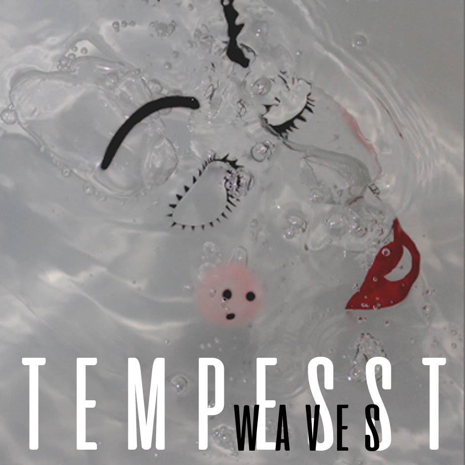
The image below is the picture I took in my improvised location. This was essentially in my bath tub at home. This in my opinion, and from feedback I received, looks far more effective than taking a picture of a masking in murky water that I had no control over would have.
When I was taking the images in the bath tub, it allowed me to have control over the lighting, the angles and the movement of the water in the bath tub, of which I

would not have had if I was to do his at the beach.
I took almost 20 photos that day of the mask in the bath and the picture above is my favourite by far as it has much more attention to detail.
When I started to edit my picture in Photoshop, there were some elements I wanted to remove straight away. For example, there were some elements of lens glare and the string that was part of the mask was still present and I wanted to remove that so that the mask looked more as though it could be part of a human face rather than an actual mask floating in water.
After removing the string and the lens flare I still wasn’t happy as I felt there were an overwhelming amount of bubbles in the image and it just looked messy so I took to Photoshop again and removed the majority of the small insignificant bubbles away.
I decided that at this point I would get feedback from my peers and this time it was much more positive with many people telling me it looked much more professional than the original image. This gave me the idea to use a pack shot. I felt that if people thought that my CD cover was that effective then I should consider using it as part of y advert alongside bold text that would make both the image and the text stand out without over whelming each other.
At first, I had the idea of including the image that I had taken for my initial print production portrait so that the mask was at the top of the poster and there was water below, similar to the above image. This to me was too crowded so I decided to use the exact image I had made for my CD cover and place it on a white background with a black border and black bold text. This looked much more effective as it was a much more minimalistic picture which I thought was more eye catching than the original idea.
The inside and back panels for my CD cover were quite simple for me as I used the same image for all 3 elements. I again used a mixture of text and imagery to create a minimalistic design that would be effective. I wanted to create 3 images that weren’t overwhelming with text so I chose to keep it as minimal as possible and add a few extras where it was needed.

Overall, from my initial idea to my final idea, I believe that without feedback I would have struggled to make something that looks as effective as my work does and I am extremely happy with what I have achieved considering my initial sketch.

Monday, 20 March 2017

EVALUATION OF 2 IDEAS


When it came to deciding which album cover I wanted to use for my print productions, I created 4 ideas and in the end I was left with my 2 favourite, and in my opinion, most professional looking images.

Idea 1 is an image of a mask suspended in water and idea 2 is a picture of a koi fish in dark murky water. Both album covers feature images of water and they both have the name of the band featured, although this is bigger in the image that features the mask.

PROS OF IMAGE ONE
-       -Idea and image one related much more to my music video. This is because I used an image of a mask, which was the same mask that I had used in my video. Similarly, I chose to suspend my mask in water which to me, made reference to the title track, Tidal Wave, but also the title of the album I had created which was waves.
-       -The colour pallet of this album cover was much more de statured, which again linked to my music video as in this, I had chosen to de saturated some of the more challenging parts of my music video.
-       -I had spent a very long time researching typefaces to use in my productions and when I found the one I have used (Aliens And Cows) I decided that this would make this image seem professional but at the same time make it a bit more playful in the sense that it wasn’t just a simple type face like Bebas Nueue which I had experimented with on the inside panels of this image.
-       -The name waves for me is a pro of this idea as it allowed me to think of ideas for song names that were surrounded by the idea of water, much like Tidal Wave.
-       -By using the images I had taken of the mask suspended in water, I had taken a lot of rough images I could use on the panels of the CD cover, for example, I had images of the water that the mask had been suspended in before the mask was placed in which meant I had more images to manipulated and use of the left, right and back panels of the CD cover.
-       -Created a strong focal point by only having one element present in the image which meant I could make links between the video and the album much more strongly. This was also genre specific as research had shown me that many indie album covers only featured one element in cover art.


CONS OF IMAGE ONE
-       Although having one image is genre specific, I thought this was quite boring and not very eye catching which I felt was the opposite of my music video which contained more than just one element throughout.
-       The placing of waves isn’t quite right as it doesn’t sit directly between the letters where Tempesst is placed.
-       I don’t think using black and white type on a grey/blue background is entirely effective. I think it would have looked better if it was all white as it would have stood out more against the de saturated background.
-       The ‘eyes’ on the mask have been distorted by bubbles in the water which makes the mask look deformed or like I have edited the image badly.
-       The colour of the cheeks of the mask could have been changed to match the colour of the lips as they look a bit weak in colour, this could made the red more prominent in the album cover and could have been used other panels on the album.

PROS OF IMAGE TWO
-       Image 2 has generic links to water and the flow/movement of water.
-       It shows an image of fish would could have intertexutal references. Could also be linked to the idea of a tidal wave as there are fish in the sea.
-       Nothing is to say that this image was taken in the sea which could make an even stronger link to tidal wave as the fish could have been washed into shallow waters by a wave.
-       You can make out my reflection in the water which makes a reference to the music video as I play the female character.
-       Could use the idea of there being one big fish in the centre of the image as a focal point and the smaller fish following as a signifier of the character’s relationship with each other.
-       The picture also shows other fish swimming in the opposite which could signify the people that surround the couple’s relationship as other people may not approve of it STRONG LINKS TO THE MUSIC VIDEO.

CONS OF IMAGE TWO
-      - The image isn’t really in focus, there is no focus on one main element e.g. The fish, the bridge or the greenery that surrounds the image.
-      - The colour pallet doesn’t really match the video as it is quite bright in terms of the fish in the image.
-      - The name of the album isn’t on the picture as the negative space is hard to interpret.
-       Name of the band is far too small and almost impossible to read.
-    -   The font doesn’t particularly suit the image itself- perhaps should be more simple.
-     -  No extra corresponding images that could be used in the CD cover panels so would have to use the same image throughout which could be a bit boring as the colour of the water is an off brown and there is no focus on the fish so they wouldn’t be easy to manipulate.
-     -  Bottom left corner of the image has a weird pattern that would need to be removed if it was going to be used.

-       Low quality image that has been taken quite badly made it hard to edit on Photoshop. 

Sunday, 5 February 2017

POTENTIAL IMAGES: ALBUM COVER

 POTENTIAL IMAGES


IDEA 1

These 3 photos were my original idea. I visited the Urban Jungle in Ringland and took some pictures of some Koy in water. The water was an idea i wanted to run with throughout my print productions as it linked with the name of the song. The fish were vibrantly coloured which linked to the genre of the song as it is psychedelic. The captured movement of the water could be easily manipulated on photoshop to make it brighter and more of a focus. I decided not to use these images as my second idea was much stronger. 

IDEA 2
These next few photos were taken at home in a bath tub with the mask we used in the video. These images help stronger links to my song as it had water movement, the mask in the video and the colours were slightly saturated so could again be easily manipulated. 
As i chose to call the album 'Waves' these linked in the sense that they showed to movement of the water e.g. Waves. They also included the mask from the 'Tidal Wave' video which I wanted to use for the front of my CD cover. These images would also be useful if I was to do a pack shot, especially if I was to advertise Tidal Wave as the top single or a new release. 


IDEA 3

When i went away in December, I visited multiple beaches and took lots of photos that I thought I could use as they contained water. (some with movement) 
I also took photos of sunsets that had vibrant colours that could be easily manipulated in photoshop. I decided not to use these ideas as my previous idea was stronger and had stronger links to my video.


IDEA 4

When I visited Urban Jungle I took lots of pictures of plants that I thought were vibrant and colourful to suit my song/video. I chose not to use these as my final idea as hey didn't really have anything to do with my song or any of it's connotations apart from the bright colours. 
These pictures would be fun to alter in photoshop but I just don't think they link well enough with my song to be used.


edited:POTENTIAL FONTS: ALBUM COVER

POTENTIAL FONT CHOICES

When it came to choosing the fonts I wanted to use for my print production, I wanted to for a sans serif type face. Sans serif fonts are much more simple but smart. 
My final decision was to use the font 'Aliens and Cows.' This font is simple and the spacing between each letter allowed me to manipulate it to allow me to incorporate the album name with the artists. 
Many of these fonts are incredibly similar (excluding last 2 fonts.) They're all very simplistic but bold. The boldness of these fonts is something I wanted to include in my print production as they look much more professional. The last 3 fonts were serif fonts, the first of the 3 was more usable that the 2 following. I felt the last 2 fonts would be more usable for the back panel of the CD cover as they're less simple but still readable whilst adding something less boring to the back cover. This being said, I chose to use 'Aliens and Cows' on the back panel too, this was to create a pattern or identity for my band as using too many typefaces can look messy and can be confusing. 


These 2 fonts were very similar to final choice of font, essentially, these were my 3 (inc. Aliens and Cows) fonts in which I just had to choose the best fit. 'Tommy Hilfiger AF' didn't look right at all. I really didn't like the way the 'M' looked as I felt it was just too wide compared to the rest of the writing. 'Bebas Neue' looked very similar to my final choice font but I just didn't like it as much as I liked my final choice font.  


These 2 fonts were too thin. I felt they both looked fairly professional but didn't think they looked part of my fairly bold theme that i have gone for with my prints. 
When i tried both of them, they weren't as easily manipulated and just didn't really look very eye-catching.
I wanted to use a much more bold font that would stand out against other album covers which is why these two fonts wouldn't work as they're much more simple and i feel as though they could be 'lost' in my images as the patterns of my images against these fonts may make it difficult to interpret. 


These final 3 fonts were taken from the 'Serif' section on Dafont.com. The first was the most usable of the 3 as the final 2 didn't really fit, especially on the front cover. 
I tried the final 2 on the back panel but, they still didn't seem to fit and it looked better to create a pattern by using the same font throughout my print productions. I felt like these fonts didn't fit as they were very artsy. This wasn't something that i was aiming to achieve. I wanted to use sans serif fonts as they felt much more simple and readable compared to a more artistic serif font. 
I think it's important that my work is readable as I feel that if i were to release it, if it wasn't readable, it wouldn't be as successful as it wouldn't be as easily interpretable.