VISUAL STYLES
ABSTRACT


The Abstract Expressionism movement began in the 1940s after World War II. The first real Abstract Art was painted earlier by some Expressionists, especially Kandinsky in the early 1900s. The main characteristic of abstract art is that it has no recognisable subject. This links with these 3 album covers as the subject of image is not clear.
40's ABSTRACT ART
Art like this is very similar to the type of abstract art in the pictures above. Today, much of this is computer generated and edited in more up to date software but still follows similar principles.


Current abstract art follows very similar principles to that of
traditional art in the sense that it uses a wide variety of colours in
different styles. There’s a lot more negative space in modern that traditional
which makes it seem a lot more minimalist.
In the traditional sense, there isn’t much use of fonts, perhaps in
advertising there will be, but in album covers and art in general here is a lack
of fonts.
MINIMALIST


Minimalism began after World War II. Mostly in American visual arts in the 1960s and early 70s. Prominent artists associated with minimalism include Donald Judd and Frank Stella.
These 3 album covers link with the idea of minimalism as the contain one simple image, little text and seem to be computer generated which i have found to be a tendency with minimalist album covers.
60 MINIMALIST ART
The use of patterns is something that is a common theme in minimalist art through time. Although computer generated, there are lots of similarities between the 2, with either monochrome or vivid primary colours being common themes.


The use of negative spaces in current minimalist art is virtually non existent. Many of the album cover that can be seen focus mainly on one central feature and leave the rest of the space on the picture as negative space. This is a much more common feature as traditional minimalist are seems to cover the entire 'canvas.' The pictures above show art works that are much busier than that of today which makes current minimalist art seem very simple but edgy in the sense that the negative spaces are left.
SURREALISM


Surrealism is a cultural movement that began in the early 1920s, and is best known for its visual artworks. The most commonly associated artists with surrealism today are Rene Magritte and Salvador Dali. Surrealism essentially focuses on what is not real and this is clear with all 3 of these album cover as they all display something that isn't technically possible.
20s SURREALISM
This art from the 20's differs hugely from that of today, although it is all similar in the sense that it shows something unrealistic, it is much more simple in the sense that it shows one or 2 subjects that can be imaginable where as current surrealism is entirely computer generated and doesn't really resemble the original style in many ways other than it doesn't look real.


In more
modern surreal art, the typefaces used, especially on album covers and advertisements,
are very serif type faces. These are simple in the sense that they don’t distract
from the ‘point’ of the picture.
The use of colour itself is very similar, if not
brighter. The colours help to create a more surreal effect in the sense that
they can help to distort the image. In modern art, the colours used are much
more primary that link more strongly to that of pop art.
POP ART


Pop Art began in the 1950s, but became more popular in the 60s. It started in the UK , but became a true art movement in New York City with artists like Andy Warhol being the most recognisable name to date.
60s POP ART
Original pop art is something that is incredibly similar to that of today in the sense that the same bright colours are still used on the same styles. In the case of the pictures that contain women, they're in similar poses to that were used in the 50s and 60s and are 'edited' in the same way.


Pop art is
a style is a style that hasn’t changed much over time. The colours used are
still the same vivid primary colours that were used when pop art first came
about. Even the positions the subjects of images use, are similar if not
exactly the same as traditional styles.
Pop art is
style that has seemed to grow with the times as it has become a style that is
used for all sorts of advertisements of a similar style to the CD covers.
USABILITY
The 4 chosen styles are ones that I would consider using. Using
pop art is probably the least likely
of the 4. The one thing I would take from that style is probably the colour
scheme. Our song is considered to be of a psychedelic genre which would link
well with a brighter colour pallet. Its general images convey a portrait of a
person or an object which isn’t the type of thing I was aiming to use.
Surrealism would
be a considerable choice in the sense that my song isn’t entirely generic and
contains elements that could be linked to the idea of surrealism.
The colours used in surrealism are a bit too muted to be
used in my CD cover.
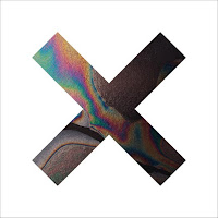
Abstract and minimalist are the 2 styles that I am likely to
use more than the others. Something more minimal would fit better towards the
target audience of my band/ video. Looking at bands like The XX, they’re well
known for their minimal abstract album cover/advertisements. They have a similar
target audience to my bands and have created motif with their album covers
which is, again, something that appeals to their target audience and makes the
easily identifiable.