Sunday 26 March 2017

CASE STUDY: HOW DO ARCTIC MONKEYS ENGAGE WITH THEIR AUDIENCE THROUGH THEIR ALBUM ART?

HOW DO ARCTIC MONKEYS ENGAGE WITH THEIR AUDIENCE THROUGH THEIR ALBUM ART?

Arctic Monkeys are an English indie rock band formed in 2002 in the UK. They have released six albums since then and have won many awards including multiple BRITs.
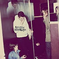
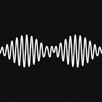
The images below how 3 of the bands albums. The art for these albums is non as consistent as other bands or artists I have previously studied. For this reason I am going to focus on the album entitled ‘Whatever people say I am, that’s what I’m not.’
The generic fan of the band is male aged between 18 and 24. This album art, to me, is so important as it is appealing to this market.
In basic terms, this album is appealing as the main image in the album is a man smoking against a negative space. This single image links to the indie genre as this is a characteristic of that, but, this in an image that could be attractive to both genders of audience. For men, this could give them an aspirational image and for females, it may be something ‘nice’ to look at. They connect with their audience by using an ascetically pleasing image that may entice people to buy the album based on that image.
In terms of composition of this album art, it is simple. As there is only one image, the rule of thirds and a shallow depth of focus are used. This means that because there’s only a plain colour background, this focus remains on the image that is present on the cover.
There is also the use of a logo in this image which was once used to create a visual motif and more of a strong identity for the band. This logo was dropped after this album in 2006 as they felt the logo didn’t relate to the band or their music anymore.
The man’s face and hand that is holding the cigarette are also in extreme focus which could be seen to be promoting images of smoking or holding authority over the audience in the image but using a direct mode of focus.
WHATEVER PEOPLE SAY I AM, THAT'S WHAT I'M NOT
Colour in this image is something that can have many meanings, for example, the image is black and white which could mean is may have mysterious connotations. In my opinion, this has been done to connect with their target audience as it creates a much more indie style image. The use of black and white takes the identity of the man in the image and creates a new one that may be more identifiable for the consumer. It may also make the audience feel as though he is a figure of authority over the person who is buying the album.
There isn’t much Negative space in this image as most of it is taken by either the man in the image or the band logo. The backdrop of this image is what looks like a pair of black curtains. This creates an element of negative space but as there is detail in this part of the image, it is not entirely negative. I think the space is used efficiently as it allows the audience to focus on the man in the image rather than the black space that surrounds him.
The type used in this image is fairly simple as it only contains the bands logo on the front of the album. This engages with their audience as it creates something that would be memorable for the audience to look back on. For example, if this logo was used continually, the audience would know which album belonged to the band just by looking at the logo placed on top of the image.
Other than this logo, there is no other text on the front of the album, thus creating an almost enigmatic effect that connects with the audience as it does not give the audience all of the information they are looking for straight away meaning they have to look further through the album to find out.

In conclusion, this band effectively connects with their audience in this album cover as they create an identity for the man on the front cover. This then gives the audience something to relate or aspire to, making them buy and listen to the album.
Saturday 25 March 2017

CASE STUDY: HOW DOES MARINA AND THE DIAMONDS ENGAGE WITH HER AUDIENCE THROUGH HER ALBUM ART

HOW DOES MARINA AND THE DIAMONDS ENGAGE WITH HER AUDIENCE THROUGH HER ALBUM ART?

Marina Lambrini Diamandis, known professionally as Marina and the Diamonds, is a Welsh singer-songwriter who has been releasing music since 2010. She has released 3 studio albums of which have led to the motif style in the images located below.
Her target audience tends to be female with ages ranging from 18 to 25. To me, I see her as a particularly stylised singer which allows her target audience to have something to aspire and relate to.
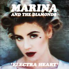
Her second album, seen below, ‘Electra Heart’ feature a made up character that went through all of the stages of typical teenage life. This was created by Marina to give her audience something to relate to and feel as though it was made for them.
The cover art of all 3 of Marina’s albums creates a visual motif for her, this combined with all of the single she has released create a catalogue of related images that make her, as a brand, identifiable. For example, all 3 albums, and singles that can be seen in the images below contain an image of her face. This image is usually central and contains a shallow depth of focus. This is so her face becomes the only thing that is important in the image.
As the album covers develop, the type on each cover changes. For singles and EP’s the type is the same depending on which album it came from, again creating a motif and making her work identifiable.
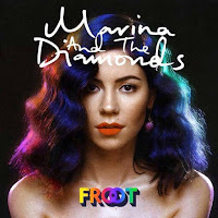
It could be said that all of the images feature in the cover art are highly sexualised. This can be seen, especially in the albums ‘Froot’ and ‘The Family Jewels’ Marina is either perceived to be naked or laying in a seductive position. This is where the element of her male target audience come in. the male gaze theory suggests that women are portrayed in a way that makes it pleasurable for me to look at and in the case of these two album covers I believe that to be true.
In Marina’s first 2 album covers, the colour tone is extremely desaturated. This gives both of these a very indie look. This could entice Marina’s target audience in the sense that she is creating something that is not stereotypical of her genre of pop which makes her more indie for her audience to look at. This would then be appealing for her teenage audience as seeing something that is slightly more individual is something that appeals to a teenage demographic.
The Electra Heart album is one that particularly stood out to me. This is the album that contains a story line of teen angst. In my opinion, Marin identifies with her target audience in these images as although she is in her 30’s she is made up to look as though she is much younger. This is a device that creates a relatableness for the audience members as they feel she is singing song about their lives.
The composition of these album covers are all very similar, again creating a form of motif. They all show Marina in character at the focal point of the image. I believe that these images are eye catching and interesting to look at as no one image is the same. As you look through the album cover, you can see the development of Marina and her music from 2010 to 2015. These images are all incredibly stylised as they show a highly made up attractive woman in a location that is more likely to be a studio location specifically for means such as shooting videos and taking pictures for cover art. Again, looking at the Electra Heart album, this is edited in a way that introduces and archaic but psychedelic element to the image without it just being a portrait which to me, would be something that would entice me into buying the album as it looks a lot more interesting than a portrait of the artist.
All three of these album covers contain different colour pallets but they all work effectively in creating a spectacle for the target audience. The first of the three, The Family Jewels contains a much more archaic colour pallet which again links to the idea of using an indie colour pallet to make the image more interesting. This is then juxtaposed with a black typeface. This of course makes the type stand out against her airbrushed picturesque face and the muted colours of the fabric in the background
Album 2, Electra Heart has a very similar colour pallet. This too contains a more archaic and desaturated colour pallet. I believe this was done to emphasise the artist’s face but also to create a vale of illusion to entice the audience as it juxtaposes her age and the way she looks in the image with the meaning of the music on the album.
Album 3 is a slightly more different image. This contains a black background with a more distorted utopian portrait. This to me is a much more modern image as it shows her as the focal point but it Is a much simpler image. Around her portrait there are flares of colour that match the type in the image. This again I believe adds a slightly more psychedelic element to the video as I makes the image much more interesting, rather than just being a portrait of her.
The use of type in all 3 albums varies and I believe this dismembers the previously created motif for the target audience to some extent. The Family Jewels has a much more hand written style type which creates a more personal message to the target audience and gives the impression that she has hand made the album for them. Electra Heart really plays on the more indie vibe as it has a serif bold font. This is more eye catching than handmade which again links to the idea of the album cover being individual as it stands out more in terms of the image, the colour and the type used. Froot links back to the first and second albums, creating a separate motif as it contains elements of both types. The handwritten font again gives the audience the impression that the album was handmade and the serif font creates a more indie yet regimented feel.
Negative space is something that is entirely common in these album covers as the focal point is the artists face. This lack of negative spaces means the audience has to focus on her making her like the main attraction in the process of buying the album. All 3 albums contain a fairly plain background which is then covered in some form of text thus creating a busy yet calm image that contains the appropriate text whilst also creating a shallow focus image to promote the artists appearance.


Thursday 23 March 2017

DEVELOPMENT OF MY FINAL IDEA


INITIAL IDEA
As you can see, my initial idea is quite different from my final piece of my completed CD cover. I sent time getting feedback and opinions from friends and teachers as to which idea they liked best out of my 4 initial ideas which lead me to choose the idea that contained the picture of the mask in the idea.
As my planning of my print productions went on, the idea of getting the mask in the sea and being able to take effective images of it in the early months of the year became almost impossible so I decided to try to improvise.
FINAL IDEA
The image below is the picture I took in my improvised location. This was essentially in my bath tub at home. This in my opinion, and from feedback I received, looks far more effective than taking a picture of a masking in murky water that I had no control over would have.
When I was taking the images in the bath tub, it allowed me to have control over the lighting, the angles and the movement of the water in the bath tub, of which I

would not have had if I was to do his at the beach.
I took almost 20 photos that day of the mask in the bath and the picture above is my favourite by far as it has much more attention to detail.
When I started to edit my picture in Photoshop, there were some elements I wanted to remove straight away. For example, there were some elements of lens glare and the string that was part of the mask was still present and I wanted to remove that so that the mask looked more as though it could be part of a human face rather than an actual mask floating in water.
After removing the string and the lens flare I still wasn’t happy as I felt there were an overwhelming amount of bubbles in the image and it just looked messy so I took to Photoshop again and removed the majority of the small insignificant bubbles away.
I decided that at this point I would get feedback from my peers and this time it was much more positive with many people telling me it looked much more professional than the original image. This gave me the idea to use a pack shot. I felt that if people thought that my CD cover was that effective then I should consider using it as part of y advert alongside bold text that would make both the image and the text stand out without over whelming each other.
At first, I had the idea of including the image that I had taken for my initial print production portrait so that the mask was at the top of the poster and there was water below, similar to the above image. This to me was too crowded so I decided to use the exact image I had made for my CD cover and place it on a white background with a black border and black bold text. This looked much more effective as it was a much more minimalistic picture which I thought was more eye catching than the original idea.
The inside and back panels for my CD cover were quite simple for me as I used the same image for all 3 elements. I again used a mixture of text and imagery to create a minimalistic design that would be effective. I wanted to create 3 images that weren’t overwhelming with text so I chose to keep it as minimal as possible and add a few extras where it was needed.

Overall, from my initial idea to my final idea, I believe that without feedback I would have struggled to make something that looks as effective as my work does and I am extremely happy with what I have achieved considering my initial sketch.