HOW DOES MARINA AND THE DIAMONDS ENGAGE WITH HER AUDIENCE THROUGH HER ALBUM ART?
Marina Lambrini Diamandis, known professionally as Marina and the
Diamonds, is a Welsh singer-songwriter who has been releasing music since 2010.
She has released 3 studio albums of which have led to the motif style in the
images located below.
Her target audience tends to be female with ages ranging from 18 to 25. To
me, I see her as a particularly stylised singer which allows her target
audience to have something to aspire and relate to.
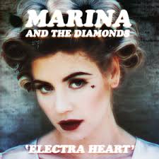 Her second album, seen below, ‘Electra Heart’ feature a made up
character that went through all of the stages of typical teenage life. This was
created by Marina to give her audience something to relate to and feel as
though it was made for them.
Her second album, seen below, ‘Electra Heart’ feature a made up
character that went through all of the stages of typical teenage life. This was
created by Marina to give her audience something to relate to and feel as
though it was made for them.
The cover art of all 3 of Marina’s albums creates a visual motif for
her, this combined with all of the single she has released create a catalogue of
related images that make her, as a brand, identifiable. For example, all 3
albums, and singles that can be seen in the images below contain an image of
her face. This image is usually central and contains a shallow depth of focus. This
is so her face becomes the only thing that is important in the image.
As the album covers develop, the type on each cover changes. For singles
and EP’s the type is the same depending on which album it came from, again
creating a motif and making her work identifiable.
It could be
said that all of the images feature in the cover art are highly sexualised. This
can be seen, especially in the albums ‘Froot’ and ‘The Family Jewels’ Marina is
either perceived to be naked or laying in a seductive position. This is where
the element of her male target audience come in. the male gaze theory suggests
that women are portrayed in a way that makes it pleasurable for me to look at
and in the case of these two album covers I believe that to be true.
 In Marina’s
first 2 album covers, the colour tone is extremely desaturated. This gives both
of these a very indie look. This could entice Marina’s target audience in the
sense that she is creating something that is not stereotypical of her genre of
pop which makes her more indie for her audience to look at. This would then be
appealing for her teenage audience as seeing something that is slightly more
individual is something that appeals to a teenage demographic.
In Marina’s
first 2 album covers, the colour tone is extremely desaturated. This gives both
of these a very indie look. This could entice Marina’s target audience in the
sense that she is creating something that is not stereotypical of her genre of
pop which makes her more indie for her audience to look at. This would then be
appealing for her teenage audience as seeing something that is slightly more
individual is something that appeals to a teenage demographic.
The Electra
Heart album is one that particularly stood out to me. This is the album that
contains a story line of teen angst. In my opinion, Marin identifies with her target
audience in these images as although she is in her 30’s she is made up to look
as though she is much younger. This is a device that creates a relatableness
for the audience members as they feel she is singing song about their lives.
The composition
of these album covers are all very similar, again creating a form of motif. They
all show Marina in character at the focal point of the image. I believe that
these images are eye catching and interesting to look at as no one image is the
same. As you look through the album cover, you can see the development of
Marina and her music from 2010 to 2015. These images are all incredibly
stylised as they show a highly made up attractive woman in a location that is
more likely to be a studio location specifically for means such as shooting
videos and taking pictures for cover art. Again, looking at the Electra Heart
album, this is edited in a way that introduces and archaic but psychedelic element
to the image without it just being a portrait which to me, would be something
that would entice me into buying the album as it looks a lot more interesting than
a portrait of the artist.
 All three of
these album covers contain different colour pallets but they all work
effectively in creating a spectacle for the target audience. The first of the
three, The Family Jewels contains a much more archaic colour pallet which again
links to the idea of using an indie colour pallet to make the image more
interesting. This is then juxtaposed with a black typeface. This of course
makes the type stand out against her airbrushed picturesque face and the muted
colours of the fabric in the background
All three of
these album covers contain different colour pallets but they all work
effectively in creating a spectacle for the target audience. The first of the
three, The Family Jewels contains a much more archaic colour pallet which again
links to the idea of using an indie colour pallet to make the image more
interesting. This is then juxtaposed with a black typeface. This of course
makes the type stand out against her airbrushed picturesque face and the muted
colours of the fabric in the background
Album 2,
Electra Heart has a very similar colour pallet. This too contains a more
archaic and desaturated colour pallet. I believe this was done to emphasise the
artist’s face but also to create a vale of illusion to entice the audience as
it juxtaposes her age and the way she looks in the image with the meaning of
the music on the album.
Album 3 is a
slightly more different image. This contains a black background with a more distorted
utopian portrait. This to me is a much more modern image as it shows her as the
focal point but it Is a much simpler image. Around her portrait there are
flares of colour that match the type in the image. This again I believe adds a slightly
more psychedelic element to the video as I makes the image much more
interesting, rather than just being a portrait of her.
The use of
type in all 3 albums varies and I believe this dismembers the previously
created motif for the target audience to some extent. The Family Jewels has a
much more hand written style type which creates a more personal message to the
target audience and gives the impression that she has hand made the album for
them. Electra Heart really plays on the more indie vibe as it has a serif bold
font. This is more eye catching than handmade which again links to the idea of
the album cover being individual as it stands out more in terms of the image,
the colour and the type used. Froot links back to the first and second albums,
creating a separate motif as it contains elements of both types. The handwritten
font again gives the audience the impression that the album was handmade and
the serif font creates a more indie yet regimented feel.
Negative space
is something that is entirely common in these album covers as the focal point
is the artists face. This lack of negative spaces means the audience has to
focus on her making her like the main attraction in the process of buying the
album. All 3 albums contain a fairly plain background which is then covered in
some form of text thus creating a busy yet calm image that contains the appropriate
text whilst also creating a shallow focus image to promote the artists appearance.
No comments:
Post a Comment